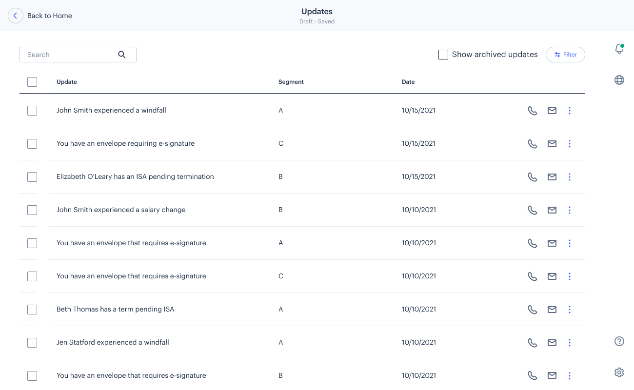
I designed an integrated feature that surfaces real-time, actionable insights to Northwestern Mutual financial advisors
Background
For financial advisors at Northwestern Mutual, timing is critical. The promptness with which they respond to a significant change in a client’s finances or life situation can mean the difference of earning or losing an opportunity for increased earnings. Multiple studies conducted by Northwestern Mutual’s research team have corroborated this, maintaining that advisors would benefit greatly from having more visibility into specific client updates that require their immediate attention, as well as the ability to act upon those updates quickly.
Against this backdrop, I, as Design Lead, was tasked with designing a feature that would meet this user need and enable advisors to capitalize on lucrative events occurring within their practice.
Team and Timeline
Cross-functional team consisting of Design Lead, Product Manager, Research Lead, and Engineering Lead
October 2021 Kickoff; Ongoing
Problems
Poor visibility into time-sensitive client info.
Inefficient, time-consuming, and unreliable processes to access client info.
Goals
Surface relevant info and drive “next step” interactions.
Minimize toggling between systems.
Drive engagement on platform.
Initial Designs
Testing
With the initial designs established, it was time to assess their effectiveness. Using my designs as well as a clickable prototype that I created, we conducted concept tests and usability tests with Northwestern Mutual Financial Advisors.
Test Results
The response from test participants was overwhelmingly positive. Participants affirmed that the feature would help them keep up with client-related events and act upon them in a timely manner, bringing considerable value to their practice.
No usability issues were identified.
Some participants noted that including the client segment (Northwestern Mutual’s practice of indicating affluence level on an A-F scale) within the card would help them better prioritize their tasks according to value.
Iterations Based on Feedback
Next Steps
Release MVP, gather insights.
Iterate based on learnings.
Explore opportunities for personalization (enabling advisors to pick and choose which update types they would like to have displayed).


