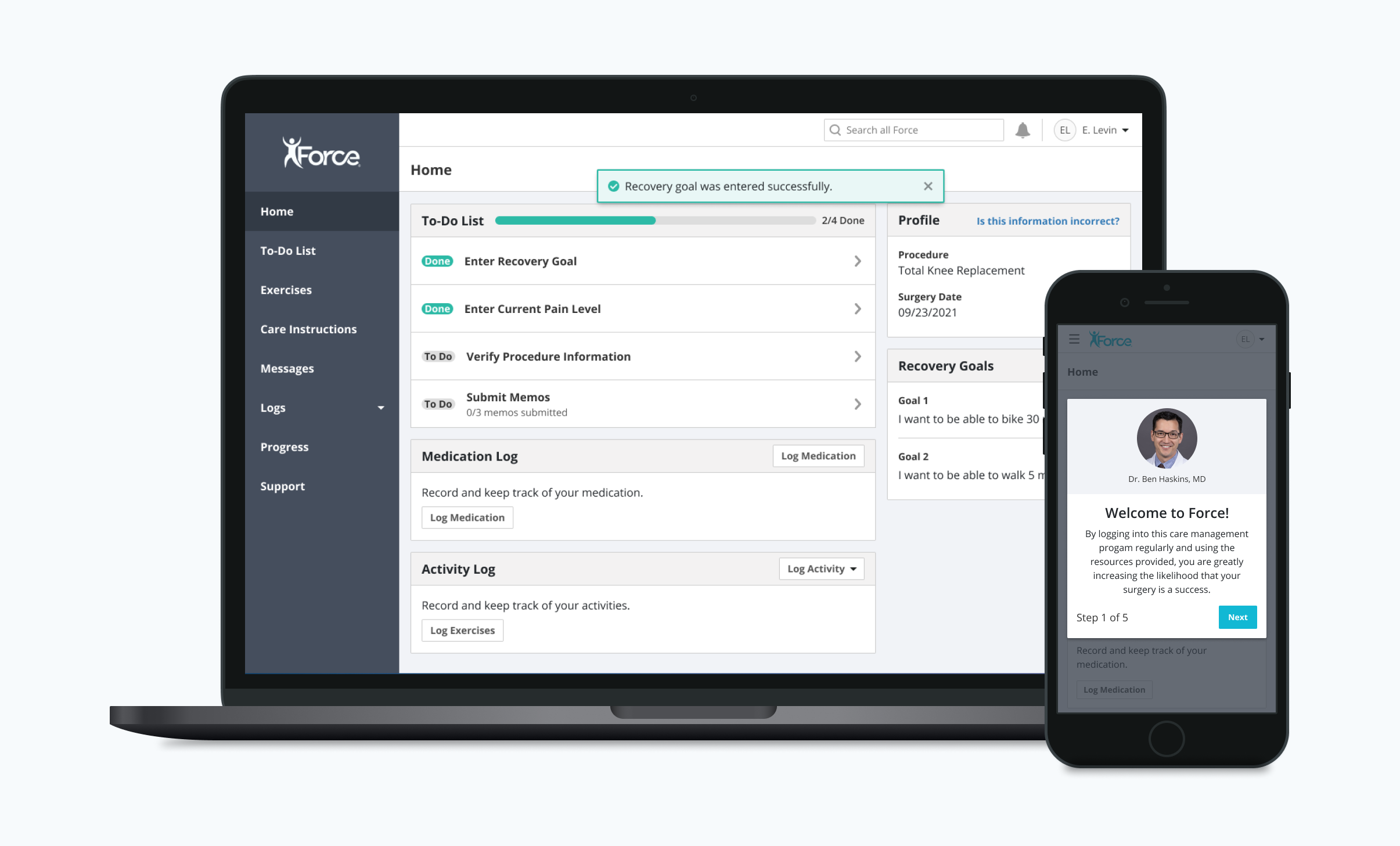
I redesigned Force’s onboarding experience and homepage to drive patient engagement and retention
Background
For years, orthopedic patients have relied on Force’s care management platform to navigate their pre-and-post-op care plans and improve their surgical outcomes. However, as of January 2021, usability issues marred the user experience, creating friction at critical points of the patient journey and causing worrisome exit rates. Furthermore, patient engagement and retention within the app, both key proxy metrics for surgical outcomes, were lagging as a not-insignificant number of users were abandoning the app after only a few uses.
Recognizing these issues, Force decided to invest in a comprehensive overhaul and redesign of the patient app. So myself, as Design Lead, along with a multidisciplinary team of a Product Manager, Engineers, and Clinical Associates, set out to transform the experience in service of both the needs of Force’s patients and the goals of the business.
Discover
Given the massive size and scope of the undertaking, we wanted to make sure we were as exhaustive and far-reaching as possible in scrutinizing the legacy experience for opportunities and pain points. So we employed an eclectic mix of research methods, from conducting user interviews, to surveys, to analytics tracking, to paint both qualitative and quantitative portraits of the experience.
Heuristic Evaluation
I conducted a heuristic evaluation of the legacy platform to see how it performed against established usability criteria. The results were enlightening if not totally surprising. They highlighted many egregious usability errors in the Force patient experience, particularly with regard to system visibility.
Usability Testing the Legacy Platform
Our analytics revealed that a significant number of patients were abandoning the app during the onboarding sequence. Hoping to discover the reason for this trend, I conducted usability tests of the legacy onboarding experience, which ultimately pointed to poor system visibility and protracted time to value as the main culprits precipitating drop-off.
Define
Our research illuminated many compelling insights related to the legacy patient app. I collaborated with the Product Manager and a Clinical Associate to distill these learnings into a few actionable problem statements, which would lay the foundation for ideation and development.
Problems
Poor system visibility. Users can’t deduce where they are in the onboarding sequence or how long the process will take, causing many to prematurely exit the app.
Low engagement with key features due to poor discoverability. Test participants had difficulty locating Medication Log and Activity Log, both critical features in driving successful outcomes.
Poor accessibility compliance. Small, low-contrast text presents legibility issue for Force’s older patient population.
Intent on aligning the improvements to the user experience with the company’s strategic objectives, we compiled a list of goals that we would aim to achieve via the redesign
Goals
Give patients feedback indicating their progress during the onboarding process to minimize exit rate
Reduce time to value of the onboarding process so patients can begin interacting with the main features of the Force app sooner.
Drive discoverability of key features to drive patient engagement and retention
Update text styles to improve legibility
Key Metrics
Drop-off rate
Mean time spent on onboarding flow
DAU/MAU
Number of patients logging 1+ activities
Number of medications 1+ medications
Design
With the goals and key metrics of success clearly defined, I began creating concepts that I hoped would line up Force’s strategic objectives with the needs of the patient.
Usability Testing
I conducted usability tests on five orthopedic patients slated for surgery at our client hospitals to assess the performance of the design concepts.
100% of test participants were able to successfully navigate through and complete the onboarding flow.
100% of test participants successfully clicked a to-do list task immediately after completing the onboarding flow.
80% of test participants, unprompted, located the Medication Log and Activity Log on the home dashboard.
Iterate
I replaced the progress indicator UI pattern with plain text to promote clarity during the onboarding flow.
I shortened the copy featured in the onboarding modals. We observed a few test participants momentarily scan the text before clicking the “Next” button, so I hoped that using more succinct phrasing would compel users to read the text in its entirety.
A/B Testing
Using Optimizely, we released the updated experience to a small cross-section of patients and evaluated its performance against the legacy app designs using our key metrics as an objective measure of success. Fortunately, the beta release decisively outperformed the legacy experience in every measure, giving us the green light to ship it across our entire patient population.
Outcomes
~29% lower exit rate
~33 fewer seconds spent on onboarding flow
~19% higher DAU/MAU (over 90-day period)
~22% more patients logging 1+ activity
~18% more patients logging 1+ medication
Next steps
On the heels of a successful initial foray into optimizing Force’s patient app, we are looking to continue making improvements to the platform. We will retain our process of learning, designing, testing, and iterating to evolve our product in service of patient wellness and success.


